What the world’s leading forecasting companies agree on.
Every year, dozens of design authorities release their own colour trend predictions. Paint companies, forecasting houses, fashion organisations and interior design platforms. For 2026, something rare has happened: despite coming from different industries, many of these expert sources are highlighting remarkably similar colour directions.
After comparing the forecasts from some of the leading forecasters, five clear colour families stand out. These shades appear across almost every source and form the backbone of interior design for 2026.
Here’s a look at the unified palette shaping the way we’ll design hotels, homes and commercial spaces over the next year.
- Botanical Greens
The strongest trend of 2026 – and the most universally agreed upon.
Every forecast referenced some form of soft, grounded green. These aren’t bright emeralds or neon limes; they’re gentle, natural tones inspired by foliage and layered landscapes. Across the sources, greens appeared in variations like:
- Olive
- Moss
- Eucalyptus
- Grey-green
- Soft matcha
These tones feel restorative and calm, making them perfect for hospitality interiors wanting a grounded, welcoming atmosphere. In flooring, botanical greens provide depth without overpowering a space, and they pair beautifully with stone, timber, metals.
- Warm, Earth-Based Neutrals
Goodbye cool grey – 2026 is all about warmth and softness.
Neutrals continue to lead, but they’ve shifted noticeably warmer. Designers want spaces that feel grounded and comfortable, not stark or clinical. The forecasts consistently highlighted warm, neutrals such as:
- Sandstone
- Oatmeal
- Mushroom
- Warm beige
- Soft greige
These colours work as a calm foundation for almost any palette. They photograph well, make spaces feel larger and more inviting, and complement the broader shift toward natural materials.
- Clay and Terracotta Tones
Earthy colour with a soft, modern edge.
Terracotta has been creeping back into interiors for the past few years, but 2026 refines it into deeper, more muted versions. Instead of the bright terracotta of the 2000s, today’s tones are subtle, grounded and warm.
The overlapping sources highlighted:
- Baked clay
- Dusty apricot
- Muted rust
- Clay blush
These colours add controlled warmth and are stunning when used as accents in Axminster designs. They’re particularly appealing in Australian interiors thanks to our natural landscape.
- Deep Browns
The comeback colour of the decade.
Four out of the five forecasting sources highlighted the rise of rich browns. These are not dated chocolate browns; they’re layered, modern, and quietly luxurious. Think:
- Soft walnut
- Cocoa
- Deep leather brown
- Caramelised tones
Deep browns bring a sense of warmth, confidence and depth to interiors. They pair beautifully with brass, boucle, walnut timbers and stone. In flooring, they’re both practical and elegant, perfect for hospitality venues wanting a rich, grounded palette that hides wear well.
- Muted Blues
Atmospheric, moody, and incredibly versatile.
2026’s blues shift away from bright coastal hues toward deeper, more complex shades. Across numerous forecasters, the trend included:
- Storm slate
- Deep ink
- Softened navy
- Lyons Blue
These tones feel sophisticated and grounded, making them ideal for hotel bars, lounges, theatres and quiet retreats. When used in Axminster designs, they add depth without creating harsh contrast, perfect for subtle pattern work.
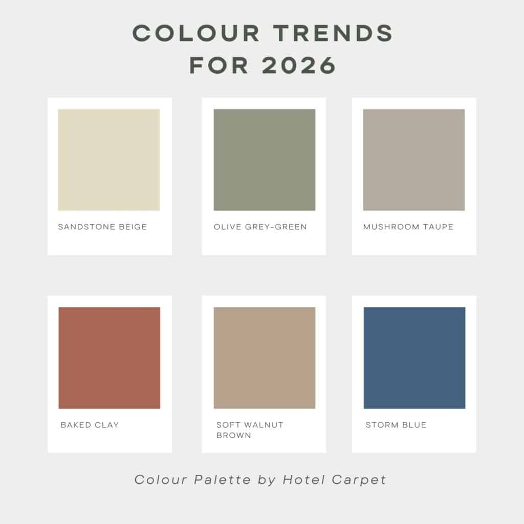
A Unified 2026 Palette
After comparing the forecasting, the strongest interior palette for 2026 clearly emerges. Here it is, refined into six practical, design-ready colours:
- Sandstone Beige
- Olive Grey-green
- Mushroom Taupe
- Baked Clay
- Soft Walnut Brown
- Storm Blue
This palette offers harmony, warmth and depth, everything designers look for in modern hospitality and commercial interiors. Each colour works beautifully on its own, but the real magic happens when they’re layered together in tonal gradients or woven patterns.
Why These Colours Work for Hospitality and Commercial Spaces
While trend forecasts often cater to residential design, this unified palette translates exceptionally well into hospitality and commercial environments because:
- Warm neutrals create welcoming, timeless foundations
- Greens and blues offer depth without visual heaviness
- Browns and clay tones bring grounding warmth
- All six colours hide wear, shading and tracking around carpeted areas
- Each colour sits comfortably in a multi-tonal Axminster weave
Together, the palette offers longevity – visually and practically. These are colours that look contemporary now but won’t date quickly, which is essential for flooring investments.

